Wednesday, April 28, 2010

Visualizing the Overlaps between Mathematical Fields


The above visualization comes from a dataset that compiles the number of papers that were published in two fields of mathematics on arxiv.org between 2004 and 2008.
The opening visualization shows all of the connections between all fields, but the visualization is interactive. Users can click on a circle to focus on one field in particular.


Standalone page of the visualization can be found here.

Thursday, March 4, 2010

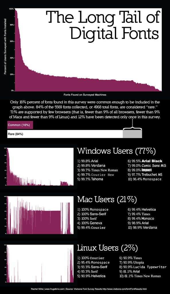
Font Standardization Across Platforms


This visualization uses the data collected in VisiBone's Font Survey.

Thursday, February 18, 2010

The Design of Everyday Things

Today I read Donald Norman's "The Design of Everyday Things," which investigates the principles of design that make a product intuitive or not to the user. Peppered with anecdotes, the book harps on common ways in which modern design baffles users. Norman presents seven guiding principles of good design:

1) Use both knowledge in the world and knowledge in the head
2) Simplify the structure of tasks
3) Make things visible: bridge the gulfs of Execution and Evaluation
4) Get the mappings right
5) Exploit the power of constraints, both natural and artificial
6) Design for error
7) When all else fails, standardize

Granted, some of these might be confusing to someone who has not read the book, but I suppose that is the whole point of reading it. Anyway, I chose to read this book in order to get a better theoretical understanding of how to design user interfaces, which is a key component of interactive data visualization. While the projects completed within this thesis might not be terribly interactive, it is a field I would like to pursue more in the future.

Tuesday, February 9, 2010

Hourlybinx Project

For the past week or so I've been pushing out data to my hourlybinx twitter account. I record when I wake up, when I go to bed, when I eat meals, and when I drink caffeine or alcohol. In addition, I check in every hour to record my energy and happiness levels.

Once I had amassed enough data, I used the python twitter module to connect to the twitter API and pull all of the data. I then parsed it in Python and exported the data as a CSV. I then read that CSV into Processing and used that to graph the information.

The final project can be viewed
here. All of the aforementioned data is shown on a day-by-day basis, and there is user input to switch between days. The project uses a sample set of 200 tweets, but I am still running the Hourlybinx Project, and at some point I will update the site to reflect the larger data set.


I'm not sure how long I am going to continue running this project, but if I get enough data I could start doing weekday averages or something else. Hourlybinx data is public and freely available to anyone else wishing to use it.

Saturday, January 30, 2010

Tagcloud Proof of Concept

Lately I've started working on a couple projects of my own, including one about fonts. I'll write a more detailed post when I have something more substantial to say, but here's a quick proof of concept for a tag cloud. Featured are the tags that occur more than 1000 times in the dataset, and size is (tagcount/1000)*10, with random distribution on the x and y axes. Color is RGB(tagcount%255, 0, 0) just to make it more pretty. Hopefully I will have more exciting projects to show soon!

View it large here.